
Mosaic Words is a publishing company with the aim to create story books on green literature. With each book, we aim to raise the collective consciousness of the society in totality about our environment, about earth and the many species which inhabit it. A lot of thoughts were brainstormed to decide about what could be the logo for Mosaic Words, through which we are able to express our vision. There is a little story behind how we came up with the logo, and it starts through our Labrador Zuzu, who lived whole 13 years with us. We lost him on the night of 18th Jan 2024. What followed was quite distressing, my son experiencing a personal loss for the first time in 10 years of his time on earth.
After many days of his outbursts at varied times in a day he decided that he would get a tortoise as a pet, because they can live up to 100 years. I well, acknowledged his thought but told him clearly that those belong to forests not home. One evening as I was working late, I looked up the wall of my room. Hanged in there a Tortoise painting my mother made using Mandala art. And thus struck the idea, that lets explore Tortoise as the center for the Mosaic Words logo. With this thought I explored what does Tortoise as a symbol stands for. I was delighted to find it stands for wisdom, longevity and knowledge.
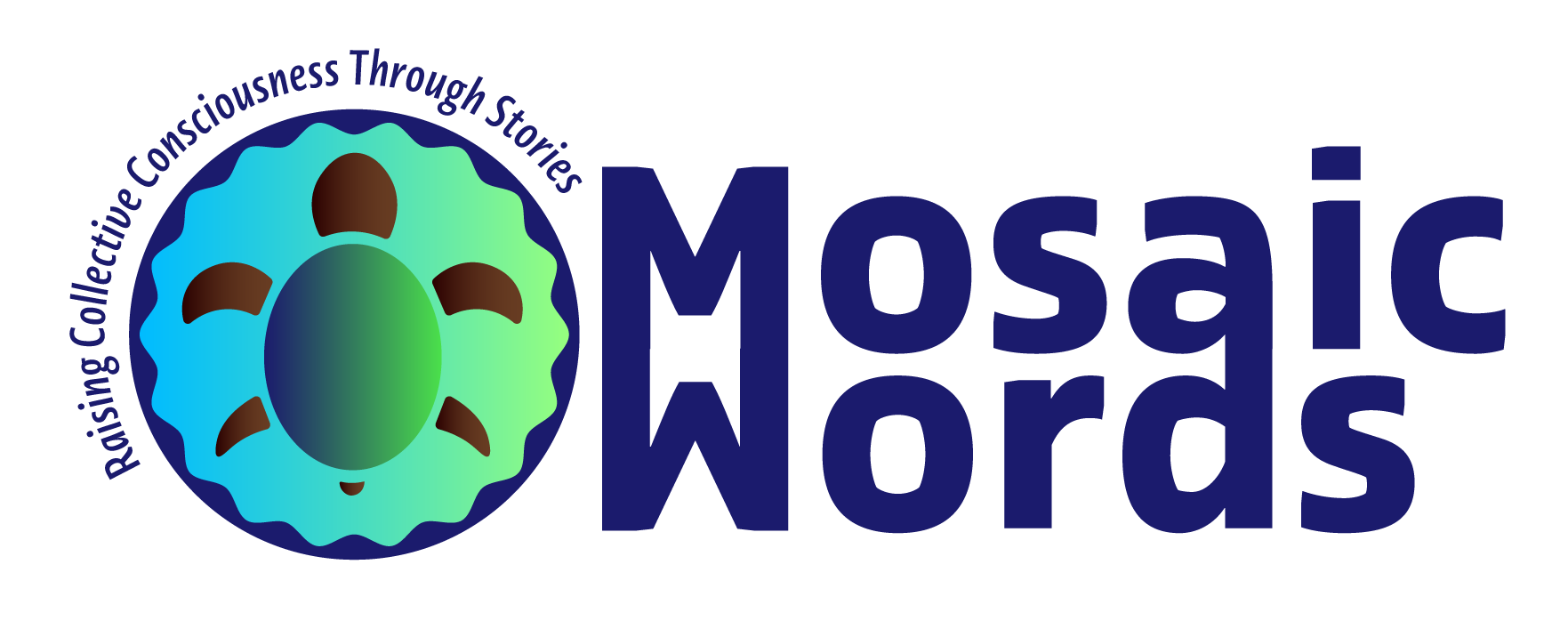
I shared my vision with Ranjana, from Vive Studios. She came on board to help create the logo for Mosaic Words. She patiently iterated through the ideas, and designed a beautiful logo. She represented the head of the Tortoise as sun shining, and its limbs she related them to leaves of trees and horns of animals. She even imagined the Tortoise shell as egg, a symbol for nurturing life. I was very impressed with this detailing. Next we decided on the colors. And she gave me a beautiful Indigo. I simply loved that earthy color. Indigo is a special color, a natural dye which we get from plants. It had a tribal appeal to it. And yes, you are right I did search for what this color stands for. And well it was as if God sent me a message, the beautiful color Indigo, one of the colors of rainbow as well stands for justice, creativity, dignity and wisdom. It was like a perfect fit to our Logo design.
We had a few discussions around how we would want to place the Tortoise, and I wanted a circle. A circle to represent the Earth. A circle to represent the "circle of life". A circle fitted perfectly in our vision. The blue and green gradient colors used in the logo represents Earth, the green its forests and the blue its seas. And then magic happened. Ranjana shared the word MosaicWords, with M and W mirroring each other. This I had thought of, when I created a doodle of the word, but I made M and W as a DNA strand. I never shared that with her, but when I saw the image she shared, it was a Eureka moment. Ranjana went a bit further than a simple mirror reflection, she told me it resembles an open book! And well i simple gaped at it.
Ranjana has beautifully explained the logo with more details, and I would like to share the picture here, for you to feel the joy like we did, when the Logo was finalized. A labor of our love.
![]()
I am immensely grateful to Ranjana, founder of Vive Studios. And I am so thankful to her for creatively placing the motto of Mosaic Words, which is "Raising Collective Consciousness Through Stories". We hope that you also fall in love with our logo, like we did. And with each book we create and you read, we fall in love with our Earth and its many amazing species. Writing this blog on Earth Day, which we celebrate today makes it all the more special.